
Have you ever looked at a logo and felt like there was more to it than meets the eye? That’s because many logos actually have hidden meanings tucked inside them. These little design surprises can be clever, funny, or meaningful—and often, you don’t notice them until someone points them out. Once you see it, though, it can make you feel more connected to the brand, like you’re in on a little secret.
This post is a shout-out to the brilliant designers who’ve managed to pack extra meaning into such simple images. It’s also here to inspire newer designers by showing how a logo can do more than just look nice—it can tell a story.
Let’s take a look at some logos with hidden meanings you might not have noticed before.
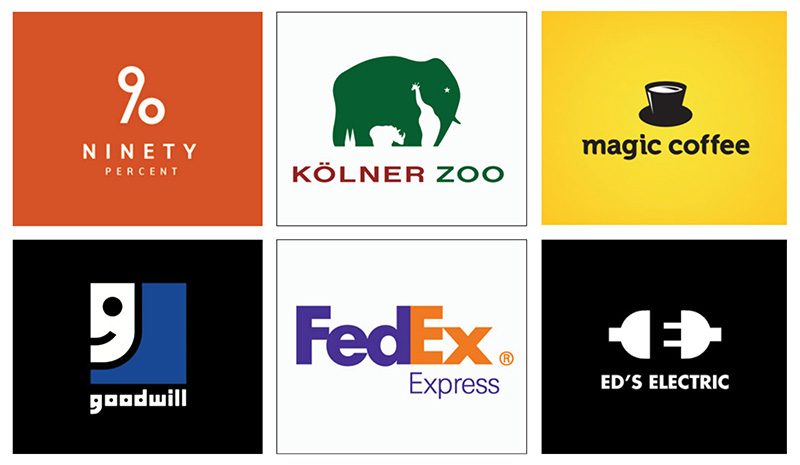
Pictured from Left to right:
1. 90 Percent—At first, you just see the number 90. However, the number 90 is designed in a way to turns it into a percentage symbol as well.
2. Kölner Zoo—A great example of white space use, with several animals blended into one.
3. Magic Coffee—It’s a hat and it’s also a coffee cup.
4. Goodwill Industries—Half the face of a smiling face, but it’s actually the first letter of the brand’s name.
5. FedEx—FedEx is a global brand recognized by most, but with a hidden feature, a little arrow in the “Ex” part of the logo design.
6. ED’s Electric—An electric plug about to be connected using the initial letter of the company in the white space of the plug.
To see more cool logos go to; https://www.designer-daily.com/20-cool-logos-with-a-hidden-meaning-185809
Design Interface Inc. can show you what is possible. Our forward-thinking solutions for product design, package design, medical device design, graphic design, and photography unlock the value of your ideas as we communicate your message and goals. See more here: https://designinterface.com/