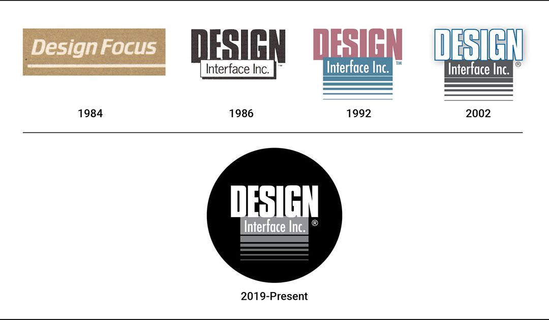
Our founder, Carla Blackman, started the design agency in 1984 (first called Design Focus). In 1986, we incorporated and launched Design Interface Inc. with a new logo. Our brand emphasized DESIGN with block letters in a font called Impact to showcase our core competency.
The block under DESIGN held the words “Interface Inc.” and it gave the logo some dimension. The trending colors at the time were salmon pink and light blue (who knew we would cringe at this 35 years later).
In 1992, as we moved to our current location, an updated logo was in order. The word DESIGN stayed dominant, still in pink, adding a solid blue box, with reversed type “Interface Inc.” in Futura Condensed. Bars were added below the block to suggest movement.
To make it more web friendly, we updated our logo again in 2002 making some color adjustments. We kept the blue color, but only used it to outline the word DESIGN. The big change took place with the block and lines that became dark gray.
Finally in 2019, the DI logo was enclosed in a black circle allowing the graphics to pop. We reversed out the word DESIGN and lightened the gray block and line pattern making it easier to use in social media. This is the logo we currently use and love…for now.
Design Interface Inc. can show you what is possible. Our forward-thinking solutions for product design, package design, medical device design, graphic design and photography unlock the value of your ideas as we communicate your message and goals. See more here: https://designinterface.com/
Graphic Design Cleveland Ohio | Package Design | New Product Design

