
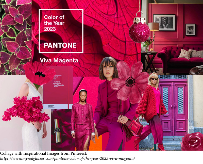
The Pantone Color of the Year has become a significant event in the design world, with companies and individuals looking to incorporate the chosen shade into their products and spaces. Viva Mengenta, which Pantone explains is “vibrating with vim and vigor,” is a natural shade from the red family and demonstrates a new symbol of strength. It is a bold red tone that could drive design to create a more positive future.
The Executive Director of the Pantone Color Institute, Leatrice Eiseman, said that this shade takes its cues from nature. Viva Magenta, Esieman notes, communicates power—but in an assertive, not aggressive way. “It’s a color that really vibrates with vim and vigor, that demonstrates a new signal of strength, which is something we all need for a more optimistic future.”
Viva Magenta is perfect for adding a pop of color to any design. Some examples of places where you might encounter viva magenta include logos, brochures, posters, websites, and social media ads. It can also be found in fashion, accessories, and home decor items.
Ready to immerse yourself in 2023’s Pantone color? Here’s everything you need to know about Viva Magenta, and how to splash this year’s color of the year across your designs and creative projects. Read more: https://www.pantone.com/articles/color-of-the-year/what-is-viva-magenta